Thomas Sanderson: Seeing the difference
Category
Brand Identity, Digital Design, Graphic Design, Packaging, StrategyThomas Sanderson has a great product but had been left behind as the world of home decoration and interior design had moved on.
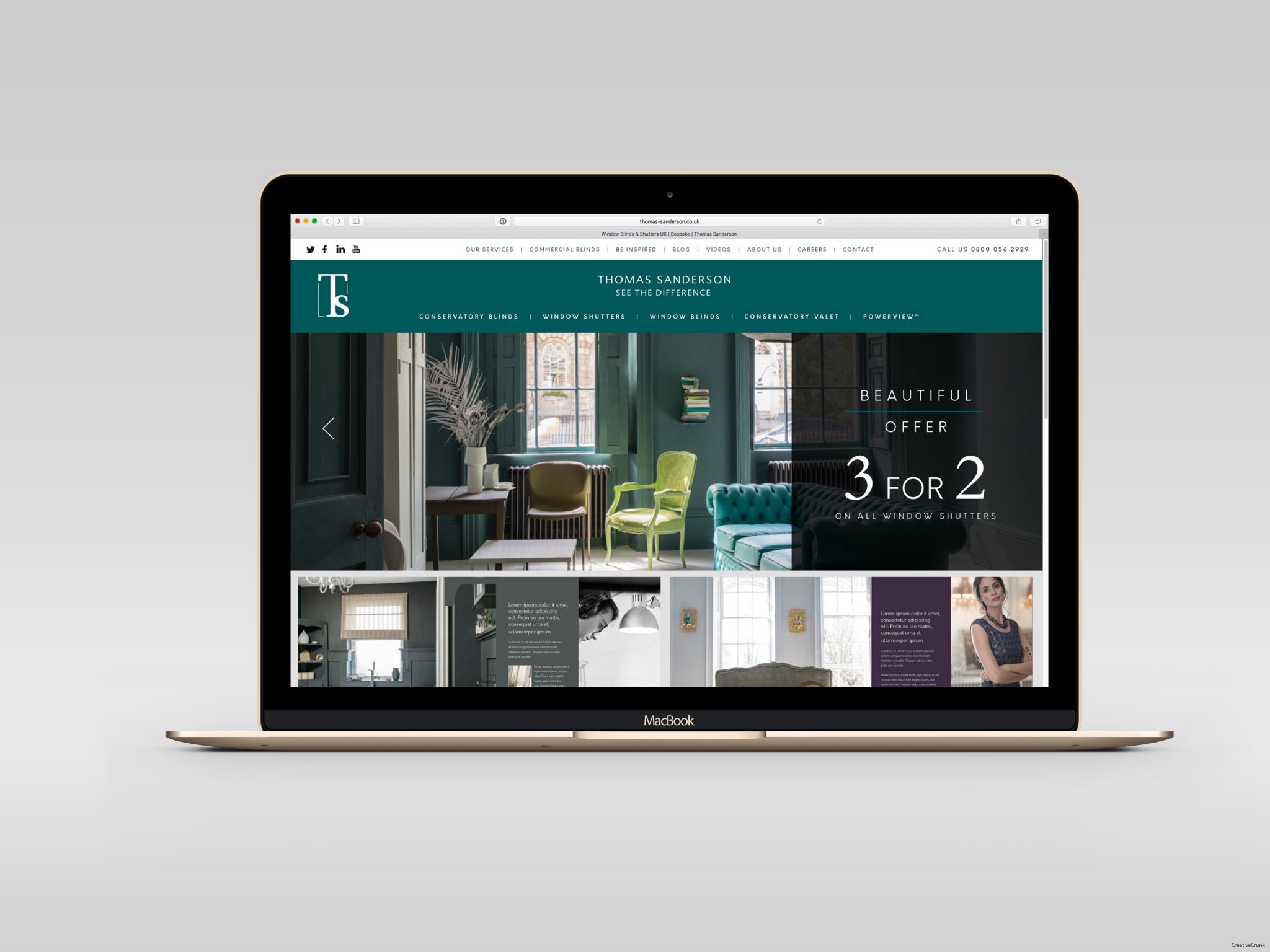
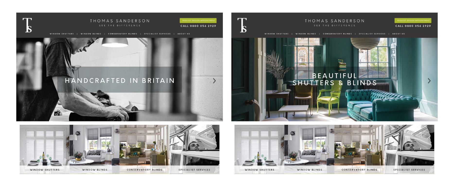
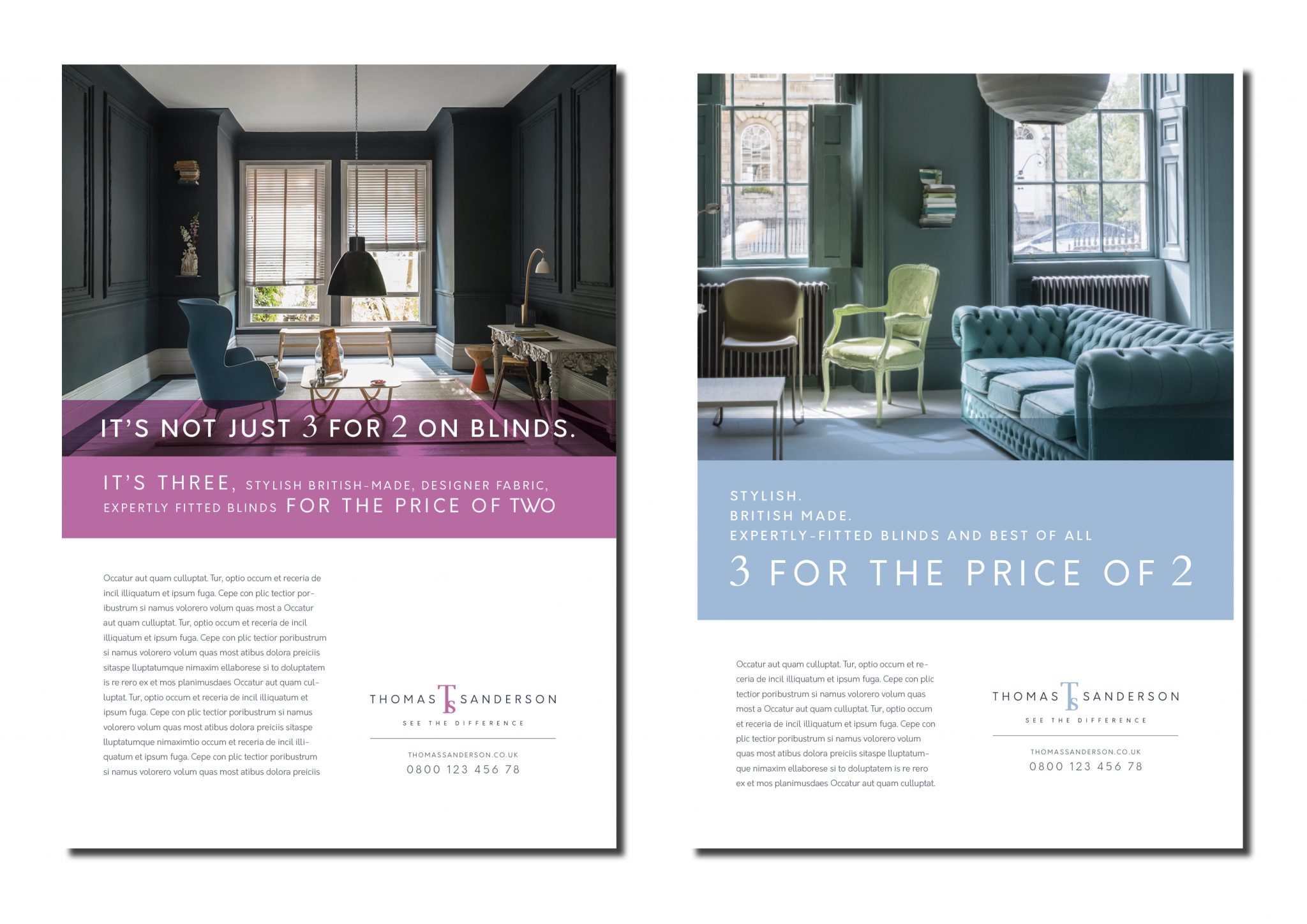
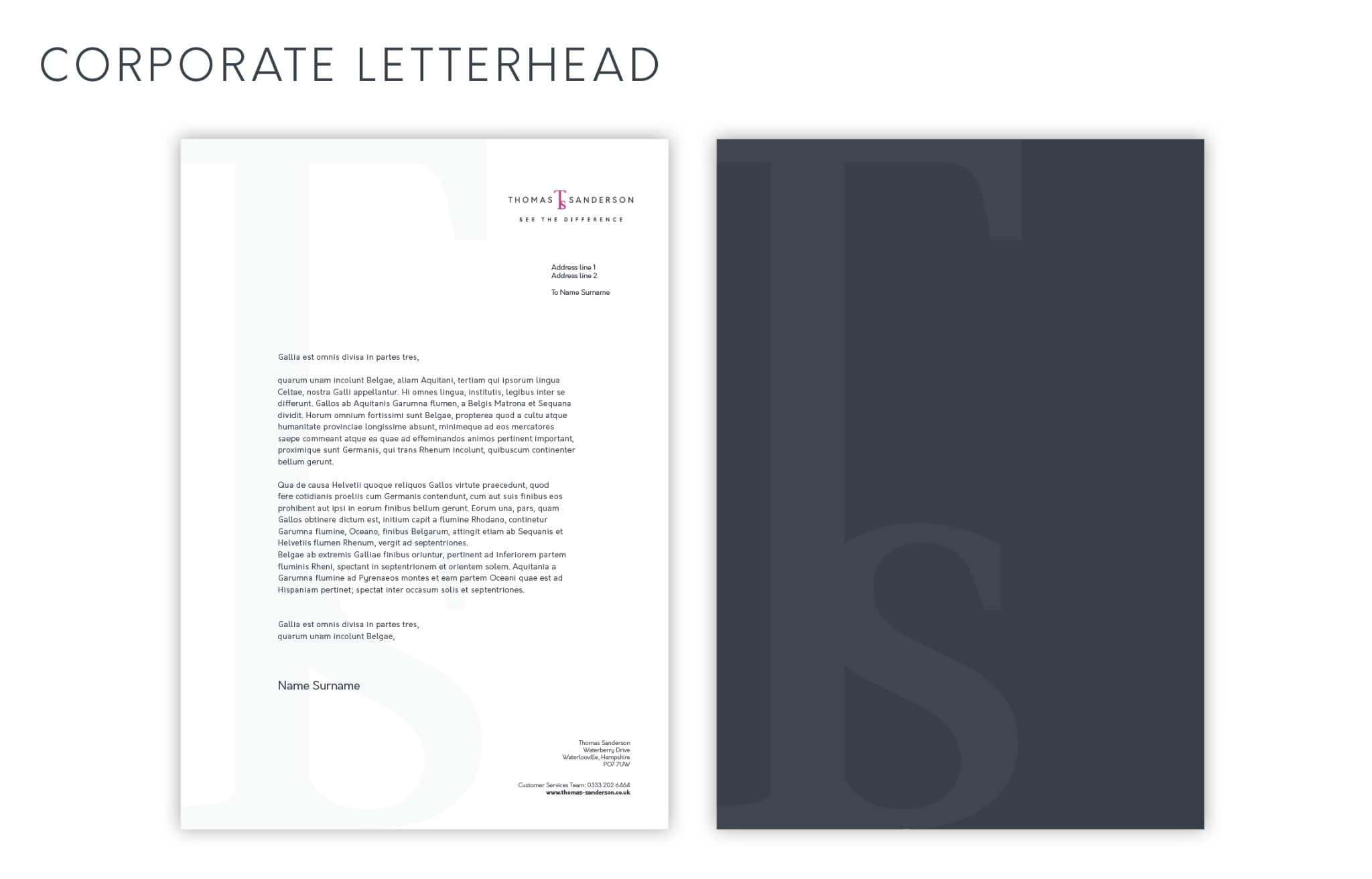
Working with our friends at King Campbell, we repositioned Thomas Sanderson as a premium quality, design led product, hand made in the UK.
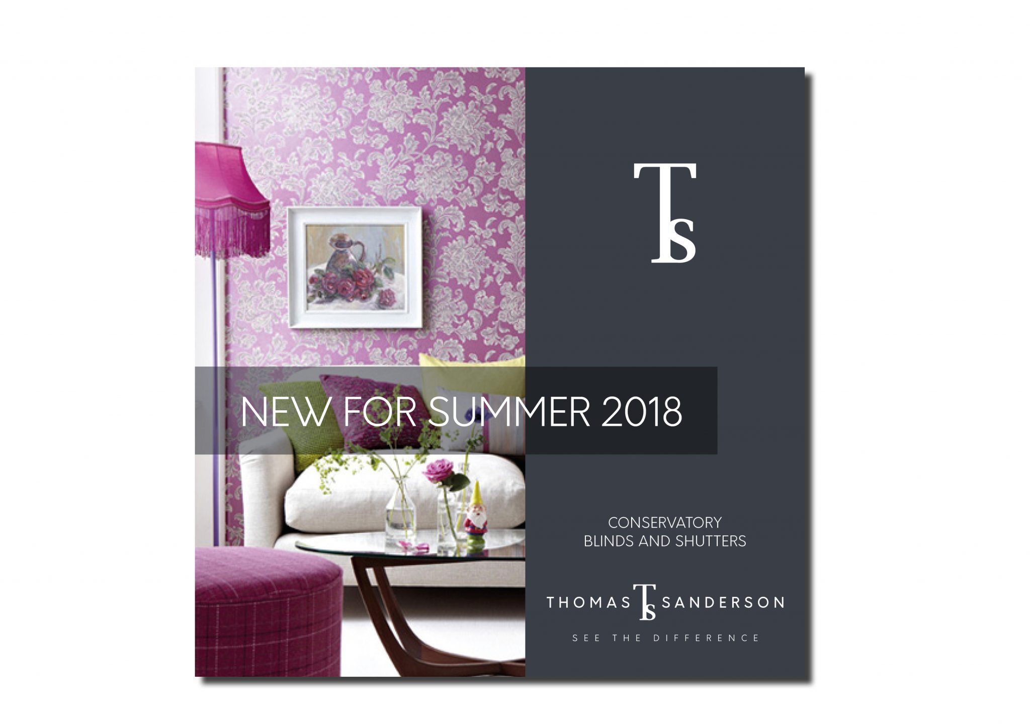
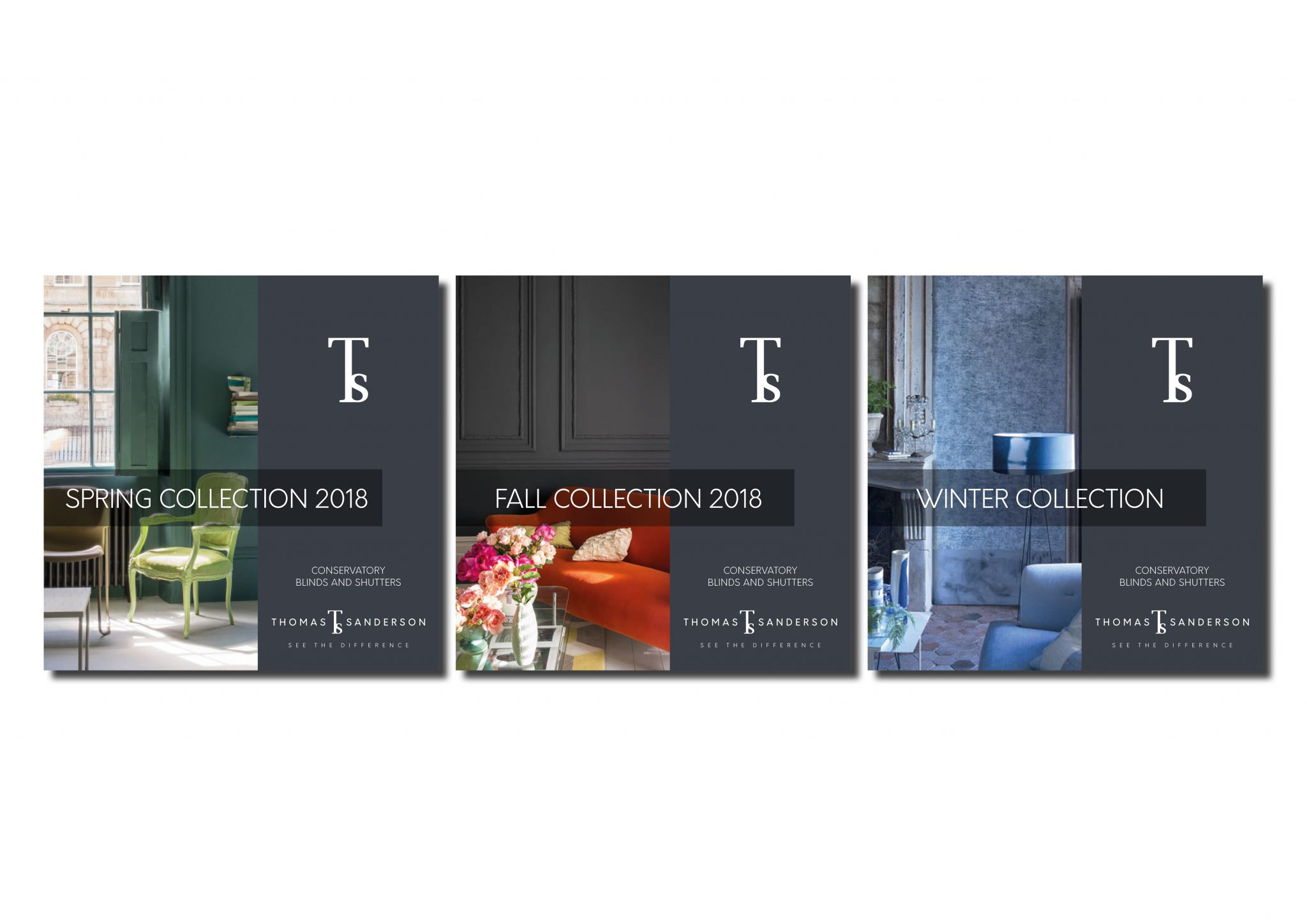
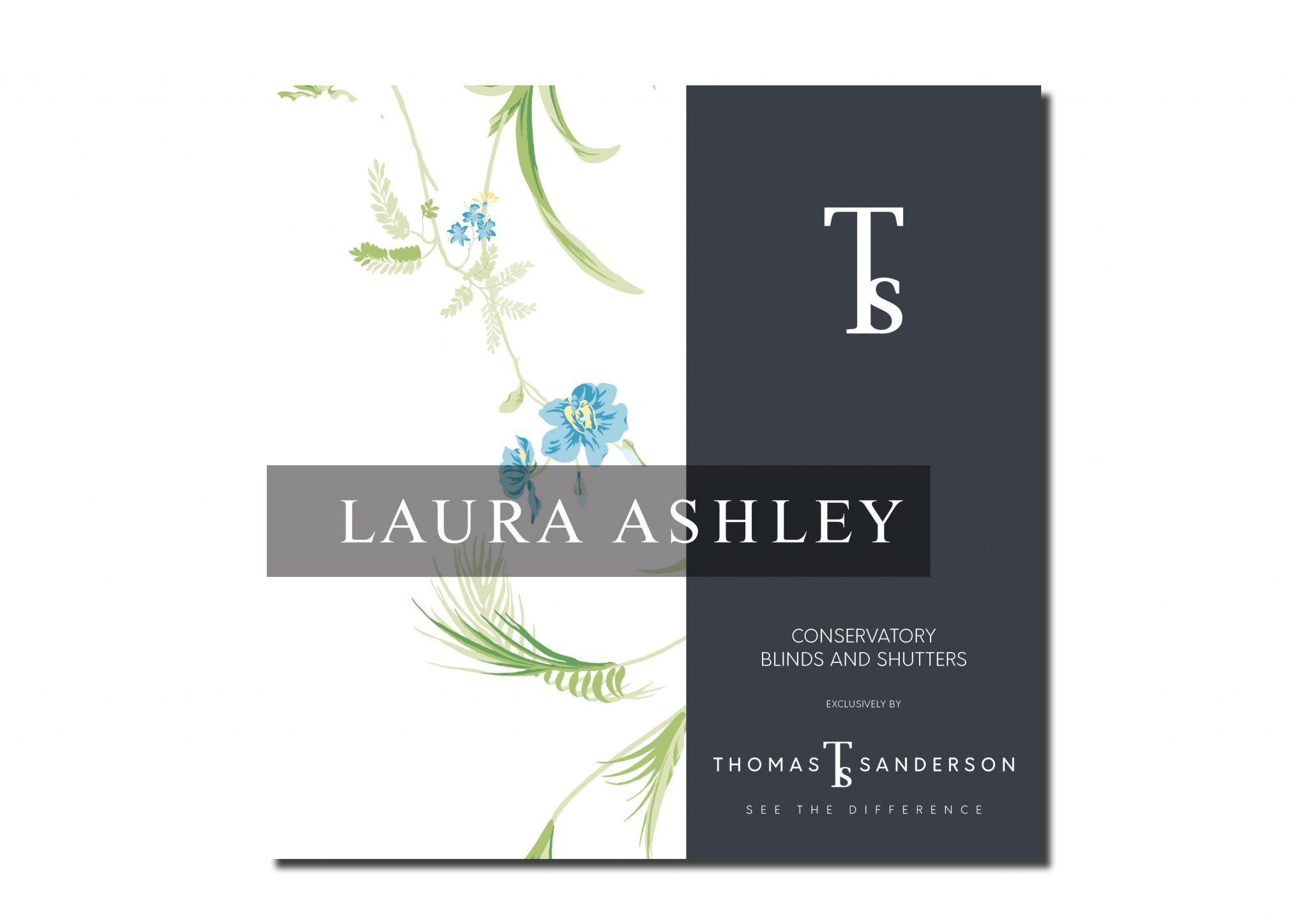
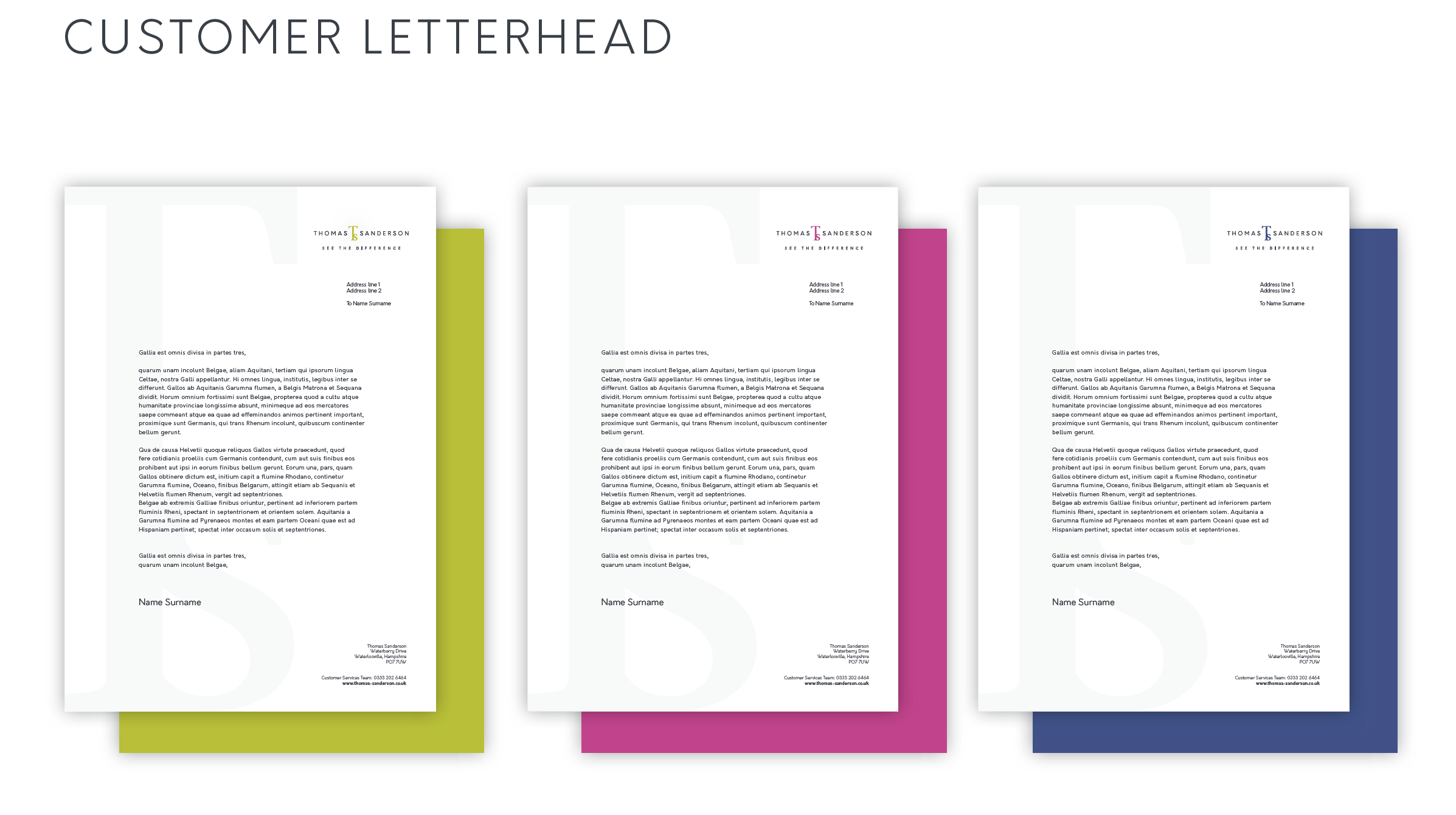
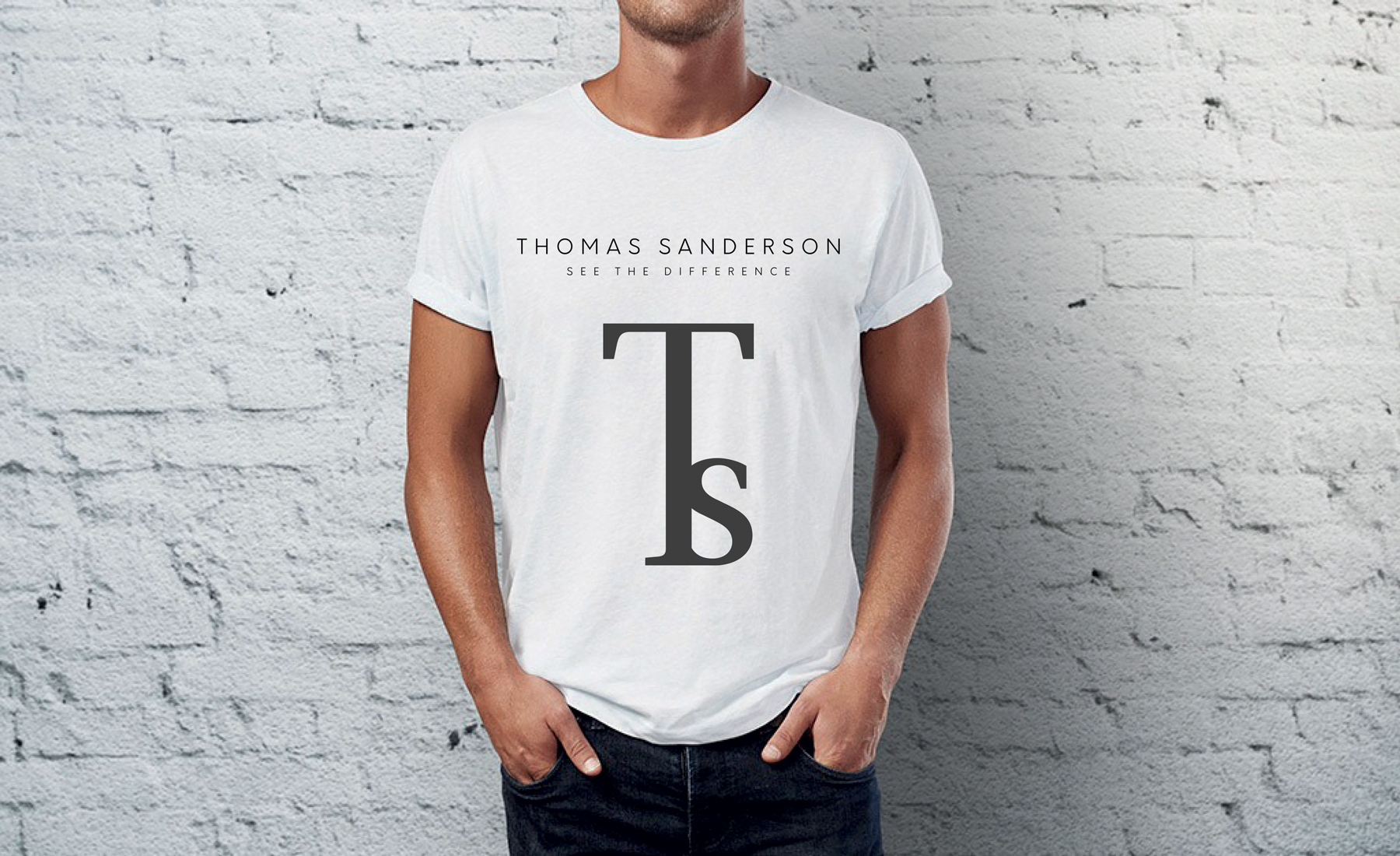
We created a new identity signified by a new logo based on the tradition of the ‘makers mark’ using a contemporary yet timeless font and used seasonal colour palettes to demonstrate interior design credibility while constantly refreshing the communications.
We introduced photography showing beautiful interiors rather than focus just on the blinds, balanced with images of the craftsmen actually making the product to emphasise quality.
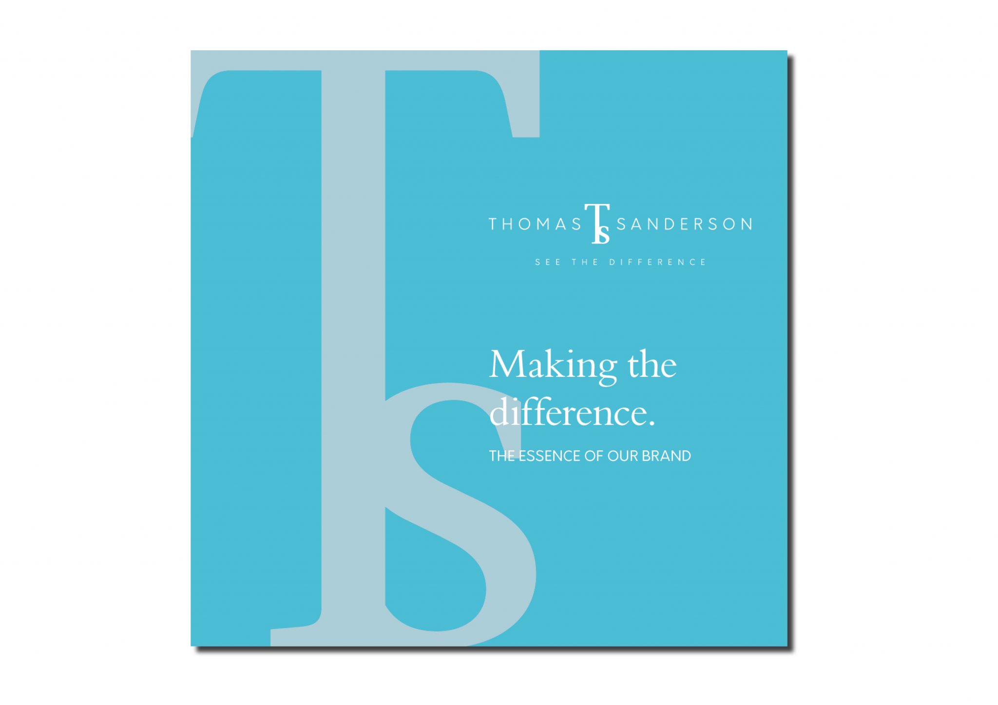
Finally we created a ‘brand story’ and guidelines to introduce the new brand positioning to the company.